Logos From Years Of Practice
RayLab Web Services

RayLab Web Services
In order to give my career in Web Development and Graphic Design the boost it needs for me to gain more clients, I founded RayLab Web Services LLC and became it's Sole Proprietor. Because of this, I developed a fully programmed website that includes information about my company, my portfolio, and a way to get into contact with me to enlist my freelance services.
For this website, I am the webmaster. Which means I am the one who is in charge of everything about it. My responsibilities include, but aren't limited to, updating the code (HTML/CSS/JavaScript/Python/PHP). I also manage the content and how it looks and is presented.
My workflow process starts with me editing the code in the Atom IDE with the window open on the left half of the screen, and the website preview window on the right half of the screen. This way, I can get immediate feedback on my code, and make sure I achieved the desired results. Once I'm satisfied with the edits I made to the source code in Atom IDE, I make the edits public by copying & pasting the new code into my website's repository; with GitHub as the Web Hosting service.
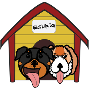
What's Up, Dog
RayLab Web Services
This is some of the logo work that I did for the company What's Up, Dog. They were very specific on what kind of look they wanted for their logo. They wanted dogs that looked cute and a little goofy. For this, I used Illustrator to create the shape of the dogs and the doghouse. This way, I can resize it how ever much I wanted. Therefore, the people of the company can use the logo in any format they wanted. I made sure to give them multipe concepts to choose from, so I could give them what they were asking for without too many miscommunications.
Paper Trail Publishing Logo & Spec Sheet
Artist Statement
If I ever came up with the idea for a publishing company, I wanted it to be cool and I think my logo represents that.
My original thought was to make a company that publishes comic books. So I kept thinking what came to mind when I thought of comics. The first word was paper. I then thought of money because paper can be slang for money. When I thought money, I thought about the saying “make it rain” and then the term paper trail came to mind. I then thought to illustrate this concept in multiple ways through multiple sketches until I figured out that the design I chose was the perfect balance of being simple, memorable, and distinct. It was also the easiest to resize and format in different settings.
For the design, I used my own hand to design the hand in the logo. I make the color look like skin because it makes the logo look less abstract and more recognizable. I added a thin outline so the shape of the hand is easier to see. For the stack of cash in the hand, I went with a simple green rectangle with no outline so it wouldn’t look like there was too much going on. I did the same thing with the bills flying in the air. With the money itself, if I gave them an outline or any more detail, the logo would look unprofessional and more like an icon or a sticker. The reason I chose the typeface that I did is because it looked like nice handwriting that wasn’t messy, and it compliments the hand in the logo so it doesn’t look out of place. I put the text under the logo for two reasons. The first is that there was more room and wouldn’t force people looking at the logo to look around too much and take their eyes off most of the logo. The second is that with the text below the hand, it makes it look like the hand itself wrote it down.
Overall, I’m very proud of what I’ve done with this logo. I managed to take a concept for a comic book publishing company and turn it into something where the companies products could be expanded upon given the logo wasn’t so synonymous with comic books that it couldn’t be applied to other types of publishable products.
Rocket Moon Comics Logo
Artist Statement
I had to create a a conceptual logo for a faux comic book store in a short amount of time. I decided to take the name of the comic book store and use it as inspiration when I was designing the logo. The idea was that the childlike nature of the logo would appeal to the store's business model of marketing to a younger demographic.
Idea Logo Concept Sheet
Artist Statement
These were the ideas for a logo that I came up with for an exercise that I would do shortly after this exercise. I had to come up with multiple variations In order to make the logo look fleshed out, and worthy of presenting.
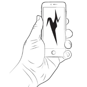
Warped Smartphone Company Logo
Artist Statement
I used a warp trick to create a logo design for a nondescript smartphone company. I did this by typing a bold "M" and using the warp tool in order to stretch and pull the "M" in multiple directions. My goal was to see how unrecognizable I could get the "M" to look from it's original shape.