
Cover Art Designs From Years Of Practice
Faux Book Cover


Artist Statement
For this exercise, I worked with a classmate (Rushtri Chatterjea) to create a book cover, spine, and back for a fake book. I mostly worked on the shadowy man and the open notebook with the flying sheets of paper.
Faux Rewind Magazine Cover
Artist Statement
For this tip I recreated a famous piece of graphic design artwork. Then I turned it into my own version of what it would look like on a magazine.
Faux Vinyl Magazine Cover
Artist Statement
For this exercise, I took my Vinylboom exercise that I worked on with (Selena Garcia) and turned it into a full magazine with two spreads in total.
Mock Vinyl LP Cover
Artist Statement
For this exercise, I made a fake vinyl record and sleeve. The idea was to come up with a design that incapsulates the title of the record. Which is supposed to be about how the record has 12 of the most popular songs in 2021.
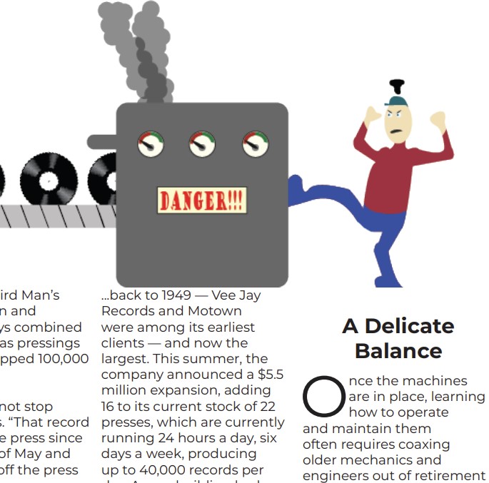
Mock Vinyl Magazine
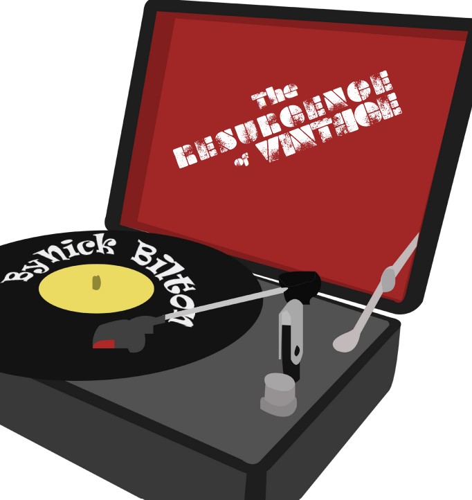
Artist Statement
This magazine was a great opportunity to showcase my abilities with not only creating folios and conceptual illustrations, but also how I can take those illustrations and orient them onto a magazine along with text from a story that is pleasing to look at.
The first thing that I asked myself when I was trying to figure out what I should put in my magazine that would actually pertain to the story was what examples of technology I should draw and put into my spreads. Once I read through the article that I chose, I found what examples of tech Nick Bilton, the writer, used in his story and used those as references. I decided that since a large part of the story is about vinyl, I made it the main theme of the magazine layout. Also, I decided to use the examples of tech at the end of the story to give the last page on the spread some life and vibrance. I put the name and logo of my magazine publishing company at the top because I’ve seen other magazines do that and I wanted to fill the dead space.
I kept the original typography of my logo because I thought it was important to keep the logo as authentic and accurate as possible since I had originally chosen that typography for that logo because I thought they worked well together. As for the typography of the header text, I wanted to use fonts that I felt represented the era of some of this tech. I wanted fonts that I thought looked “groovy” or “edgy” because a lot of this tech became popular between the 70’s and 90’s. For the body text, I settled on a font that I thought was easy to read in large chunks and was a nice break from the more elaborate fonts in the magazine.
The illustrations that I drew for the magazine took longer than expected to complete. I uploaded refence material that I found into Illustrator and used the pen tool to trace the outlines of the images. From there, I colored in all of the lines that I made. I wanted to make my drawings look as clean as possible and look like there was a lot of effort put into each of them. The car took especially long because of the number of lines and different colors with varying levels of lightness and darkness. In order to make these drawings pop out more on my magazine spreads, I decided to keep the background of the pages white for a noticeable contrast.
Overall, I’m very proud of what I’ve done with this magazine. I managed to create illustrations that I thought represented the content of the story well. Also, I was able to take those drawing and make them work well with the text on each of the pages. I strongly feel that people will be able to read the magazine article and enjoy it.