
Art Concepts From Years Of Practice
Shepard Fairey Style Self Portrait
Artist Statement
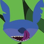
This was my presidential photo with a Sheppard Fairey art style. I started by taking a photo of myself with my version of a presidential pose. From there, I uploaded it to Photoshop and converted it to grayscale with a blown out luminosity. After that, I added shapes that would outline the areas of my face that would go from darkest to lightest. Finally, I added color and layering textures.
Paper Trail Publishing Logo & Spec Sheet
Artist Statement
If I ever came up with the idea for a publishing company, I wanted it to be cool and I think my logo represents that.
My original thought was to make a company that publishes comic books. So I kept thinking what came to mind when I thought of comics. The first word was paper. I then thought of money because paper can be slang for money. When I thought money, I thought about the saying “make it rain” and then the term paper trail came to mind. I then thought to illustrate this concept in multiple ways through multiple sketches until I figured out that the design I chose was the perfect balance of being simple, memorable, and distinct. It was also the easiest to resize and format in different settings.
For the design, I used my own hand to design the hand in the logo. I make the color look like skin because it makes the logo look less abstract and more recognizable. I added a thin outline so the shape of the hand is easier to see. For the stack of cash in the hand, I went with a simple green rectangle with no outline so it wouldn’t look like there was too much going on. I did the same thing with the bills flying in the air. With the money itself, if I gave them an outline or any more detail, the logo would look unprofessional and more like an icon or a sticker. The reason I chose the typeface that I did is because it looked like nice handwriting that wasn’t messy, and it compliments the hand in the logo so it doesn’t look out of place. I put the text under the logo for two reasons. The first is that there was more room and wouldn’t force people looking at the logo to look around too much and take their eyes off most of the logo. The second is that with the text below the hand, it makes it look like the hand itself wrote it down.
Overall, I’m very proud of what I’ve done with this logo. I managed to take a concept for a comic book publishing company and turn it into something where the companies products could be expanded upon given the logo wasn’t so synonymous with comic books that it couldn’t be applied to other types of publishable products.
2D & 3D Textures
Artist Statement
This exercise is where I learned how to create my own two dimensional textures from within Photoshop. Then I took my texture making skills in Photoshop further, and added text that bleeds into the textures. I also made three dimensional textures. That way, I can tell how well those textures could fit into a more immersive environment; such as in videogames.
Pop Art Poster
Artist Statement
One of my heroes that I decided to turn into pop art is Kevin Conroy. He is the defacto voice of Batman in animation and videogame history. I tried using colors that I thought would show his face in a more oldschool asthetic.
Minimalist Movie Poster
Artist Statement
For this exercise, I had to take my favorite movie, and make a poster for it. The only catch is that I needed to make the poster look like it only gives away very little about the movie, and the level of effort put into it needed to look miniscule.
Rocket Moon Comics Logo
Artist Statement
I had to create a a conceptual logo for a faux comic book store in a short amount of time. I decided to take the name of the comic book store and use it as inspiration when I was designing the logo. The idea was that the childlike nature of the logo would appeal to the store's business model of marketing to a younger demographic.
Idea Logo Concept Sheet
Artist Statement
These were the ideas for a logo that I came up with for an exercise that I would do shortly after this exercise. I had to come up with multiple variations In order to make the logo look fleshed out, and worthy of presenting.
Faux Nightclub Poster
Artist Statement
With a partner (Rachel Chalnick), we went outside to take some photos of textures that we saw. Once we got all the photos we needed, we went back into the classroom and decided which texture we were going to use for our fake nightclub advertisement poster. I focused on blending the textures with the conceptual design, and I worked on the layout of the text.
Faux Book Cover
Artist Statement
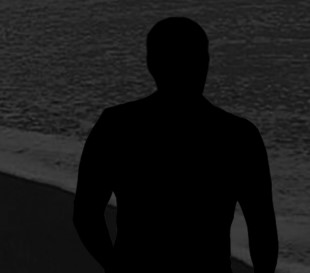
For this exercise, I worked with a classmate (Rushtri Chatterjea) to create a book cover, spine, and back for a fake book. I mostly worked on the shadowy man and the open notebook with the flying sheets of paper.
Faux Rewind Magazine Cover
Artist Statement
For this tip I recreated a famous piece of graphic design artwork. Then I turned it into my own version of what it would look like on a magazine.
Faux Vinyl Magazine Cover
Artist Statement
For this exercise, I took my Vinylboom exercise that I worked on with (Selena Garcia) and turned it into a full magazine with two spreads in total.
Mock Vinyl LP Cover
Artist Statement
For this exercise, I made a fake vinyl record and sleeve. The idea was to come up with a design that incapsulates the title of the record. Which is supposed to be about how the record has 12 of the most popular songs in 2021.
Robert Deyber Style Little 500 Poster
Artist Statement
This poster represents my interpretation of Robert Deyber's style of art. More specifically, how familiar things are taken and put into familiar situations that would be correct with other things that are similar to the other things.
My original thought was to use an influence that was more cartoon-like. I tried ideas like having a bike walk upright on a treadmil or a person having a hard time riding a bike up a hill with a droopy face. Eventually, I decided to go with a more humerous idea where I would place a bike at a gas station instead of a car. The joke being that cars and bikes are both modes of transportation.
For the design, I used Illustrator to draw the bike and to draw the gas-filling machine. I decided to make it look like the title of the poster was the name of the gas station. I used typography that I thought looked like it would be used for the sign of a diner or a gas station. I used a grey and yellow gradient to create a seamless transition between the dawning sky and the pavement. I put a shadow on the ground so it would look like there is a ground, and the bike, gas pump, and pole didn't look like they were just floating in midair. In order to make it so that the poster looked like a painting, I used a rough, wavy texture that looked like paint brush strokes.
Overall, I’m very proud of what I’ve done with this poster. I managed to take influence from Robert Deyber's art style and turn it into something that people can look at and find the humor in it while finding out about the Little 500 Race.
Mock Vinyl Magazine
Artist Statement
This magazine was a great opportunity to showcase my abilities with not only creating folios and conceptual illustrations, but also how I can take those illustrations and orient them onto a magazine along with text from a story that is pleasing to look at.
The first thing that I asked myself when I was trying to figure out what I should put in my magazine that would actually pertain to the story was what examples of technology I should draw and put into my spreads. Once I read through the article that I chose, I found what examples of tech Nick Bilton, the writer, used in his story and used those as references. I decided that since a large part of the story is about vinyl, I made it the main theme of the magazine layout. Also, I decided to use the examples of tech at the end of the story to give the last page on the spread some life and vibrance. I put the name and logo of my magazine publishing company at the top because I’ve seen other magazines do that and I wanted to fill the dead space.
I kept the original typography of my logo because I thought it was important to keep the logo as authentic and accurate as possible since I had originally chosen that typography for that logo because I thought they worked well together. As for the typography of the header text, I wanted to use fonts that I felt represented the era of some of this tech. I wanted fonts that I thought looked “groovy” or “edgy” because a lot of this tech became popular between the 70’s and 90’s. For the body text, I settled on a font that I thought was easy to read in large chunks and was a nice break from the more elaborate fonts in the magazine.
The illustrations that I drew for the magazine took longer than expected to complete. I uploaded refence material that I found into Illustrator and used the pen tool to trace the outlines of the images. From there, I colored in all of the lines that I made. I wanted to make my drawings look as clean as possible and look like there was a lot of effort put into each of them. The car took especially long because of the number of lines and different colors with varying levels of lightness and darkness. In order to make these drawings pop out more on my magazine spreads, I decided to keep the background of the pages white for a noticeable contrast.
Overall, I’m very proud of what I’ve done with this magazine. I managed to create illustrations that I thought represented the content of the story well. Also, I was able to take those drawing and make them work well with the text on each of the pages. I strongly feel that people will be able to read the magazine article and enjoy it.
Practice In Illustrator
Artist Statement
This was my warmup exercise for J465. It was the first assignment that I did in the class.
Type Play
Artist Statement
I basically typed the word design a bunch of times and tested how much I could change it. Whether it'd be cutting up the letters, distorting them, changing the angles or the opacity, or even make the letters look wavy.
Warps & Halftones
Artist Statement
This exercise is from when I was working on how to take my illustrative designs and warp them. Also, I had to make a black and white image look like it's on a piece of paper after messing with its blends and halftones.
Warped Smartphone Company Logo
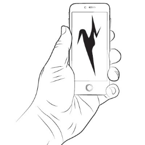
Artist Statement
I used a warp trick to create a logo design for a nondescript smartphone company. I did this by typing a bold "M" and using the warp tool in order to stretch and pull the "M" in multiple directions. My goal was to see how unrecognizable I could get the "M" to look from it's original shape.
Class Project Videogame Concept Art & Companion Doc
My game that I worked on for my Final Class Project was an idea I had that has been in the making for a number of years. The concept of the game is an RPG where the player plays as a select group of bugs to expand their bug-utopian society.
Character Sheet

Artist Statement
The good characters are meant to be the more generic bugs that are less universally scary. Some examples include caterpillars, bees, or ants. The neutral characters are animals that can be used for livestock. Some examples include gophers, chickens, or sea turtles. The bad characters are meant to be the scarier bugs and animals that eat bugs. Some examples include spiders, scorpions, or bats.
Environments
Artist Statement
The environments that I came up with are meant to represent the places where the bugs would live together and the places where they would get supplies or food. The Tree HQ is where the bugs live and where the player grows their society and land. The Beach Shack is where the player can get food or some supplies for aesthetics. The Junkyard is where the player can get supplies to further build their society.
Vehicles
Artist Statement
The mode of transportation depends on where and how the player is traveling. If the player is traveling underground, then they are riding gophers. If the player is traveling above ground, then they are driving carts made from the exoskeletons of scorpions. If the player is traveling by water, then they are traveling inside the shell of a sea turtle.