
Posters From Years Of Practice
Shepard Fairey Style Self Portrait
Artist Statement
This was my presidential photo with a Sheppard Fairey art style. I started by taking a photo of myself with my version of a presidential pose. From there, I uploaded it to Photoshop and converted it to grayscale with a blown out luminosity. After that, I added shapes that would outline the areas of my face that would go from darkest to lightest. Finally, I added color and layering textures.
Pop Art Poster
Artist Statement
One of my heroes that I decided to turn into pop art is Kevin Conroy. He is the defacto voice of Batman in animation and videogame history. I tried using colors that I thought would show his face in a more oldschool asthetic.
Minimalist Movie Poster

Artist Statement
For this exercise, I had to take my favorite movie, and make a poster for it. The only catch is that I needed to make the poster look like it only gives away very little about the movie, and the level of effort put into it needed to look miniscule.
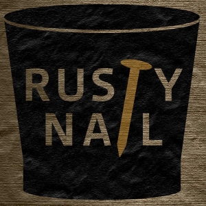
Faux Nightclub Poster
Artist Statement
With a partner (Rachel Chalnick), we went outside to take some photos of textures that we saw. Once we got all the photos we needed, we went back into the classroom and decided which texture we were going to use for our fake nightclub advertisement poster. I focused on blending the textures with the conceptual design, and I worked on the layout of the text.
Robert Deyber Style Little 500 Poster
Artist Statement
This poster represents my interpretation of Robert Deyber's style of art. More specifically, how familiar things are taken and put into familiar situations that would be correct with other things that are similar to the other things.
My original thought was to use an influence that was more cartoon-like. I tried ideas like having a bike walk upright on a treadmil or a person having a hard time riding a bike up a hill with a droopy face. Eventually, I decided to go with a more humerous idea where I would place a bike at a gas station instead of a car. The joke being that cars and bikes are both modes of transportation.
For the design, I used Illustrator to draw the bike and to draw the gas-filling machine. I decided to make it look like the title of the poster was the name of the gas station. I used typography that I thought looked like it would be used for the sign of a diner or a gas station. I used a grey and yellow gradient to create a seamless transition between the dawning sky and the pavement. I put a shadow on the ground so it would look like there is a ground, and the bike, gas pump, and pole didn't look like they were just floating in midair. In order to make it so that the poster looked like a painting, I used a rough, wavy texture that looked like paint brush strokes.
Overall, I’m very proud of what I’ve done with this poster. I managed to take influence from Robert Deyber's art style and turn it into something that people can look at and find the humor in it while finding out about the Little 500 Race.